
Exhibitions
When design covers the beating city
Architecture and design dialogue between the planned city and the lived city in the exhibition 'You put the body. I put the skin'.
The city as an urban and situated phenomenon is a complex and dynamic system in which humanity, since the Neolithic era, has been organizing its life. The architecture of buildings, whether commercial, cultural, sports, residential or religious, forms the body of cities, and design acts as a membrane or skin. This relational and dialogical link between architecture and design is the leitmotif of the choral exhibition You put on the body. I put on the skin , which, within the framework of the event Barcelona capital of world architecture , can be seen at the Dipòsit de l'Aigua Rei Martí until December 13, 2026. Without being a designer, but a firm initiate in the theory of design and art, I intend to reflect on the dialectic between the planned city and the lived city.
Despite the remote location of the King Martí Water Tank, it is worth crossing the infrastructures of the La Salle campus to enjoy a montage in which its curators, Clara Mas and Albert López-Amor, invite us to discover the intrinsic relationship between architecture and design as a kind of dialogues, confrontations, synergies and opportunities throughout more than thirty pieces and projects.
Eight spaces of tension and relaxation. In terms of the assembly, it is worth saying that the exhibition follows a zigzag itinerary that is articulated in eight spaces along a floor of seven naves, separated by arcades supported by thick brick pillars. Throughout these parts, you can enjoy the contributions of relevant historical and contemporary graphic designers and photographers who work in the city of Barcelona. Professionals who contribute, in short, to the enrichment of readings about the city and its corners, from attempts close and, at the same time, aestheticized towards the citizens and the different contexts located. In this order of ideas, we must ask ourselves what is behind the cities with their most representative buildings? Marxist anthropologist Manuel Delgado would respond, resuming his book El espacio público como ideología (2015), that there are people who interact, survive and, from time to time, rebel against the urban planning and architecture that organize and hierarchically order the city and, at the same time, control, punish and violate its citizens.
Lilly does not embroider. To begin with, the entire exhibition has used, in its signs and informative texts, the typography called Lilly (central theme of the first space), as a tribute to the designer Lilly Reich, who designed 25 stands in the German Pavilion of the 1929 International Exhibition in Barcelona. In addition, it is worth highlighting her contribution to the signage of the pavilion together with the typographer Gerhard Severain. A typography with which the designer Laura Meseguer has been able to recover and reinterpret the clarity and sobriety of the international style that Reich used in the formal sphere, as written communication and, at the same time, as a graphic work.
Rumors of the city. Regarding the space dedicated to Parla ciutat , one can enjoy—through the photographs of Rafael Vargas or José Hevia—the existence of interventions of more conceptual, ingenious and, at the same time, less controversial designs towards the prevailing socioeconomic powers, such as the signage of the parking lot of the Antiga Fàbrica Damm (2016), by Mario Eskenazi Studio and Dani Rubio; the piece Barcelona Gràfica (2005), by América Sánchez; the recording of Identity and signage of Can Coral (2011), developed by Cómo Design Studio (made up of Anna Sodupe and Susana Catalán); the Epigrafia de Barcelona (2026), by Albert López-Amor; and the lollipop entitled Bocins de fragmentas (2026), by David Torrents.
Order and creativity. As for the third chapter, Grid of Freedom , it addresses the English term grid , which refers to the basic and universal system for reticulating and ordering messages and images. In general, it is a fundamental tool in the practice of graphic design that interconnects reason, creativity and efficiency. Despite this logical predisposition in the very gesture of reticulating, a creative impulse emerges that, with practice, flows between a kind of creative order that symbolically relates the visual world of the two dimensions of the grid with the geometric and tectonic world of architecture. From this background, the curators projected a gallery or passage of ephemeral construction in which photographs of contemporary architecture are confronted with historical and more recent posters.
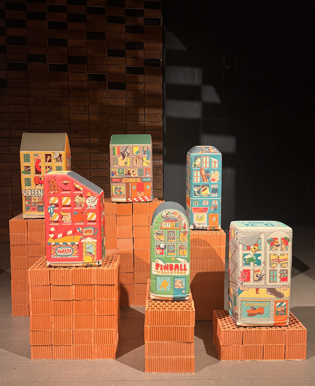
Merchandise and obsolescence. The following two parts, corresponding to Permanent Ephemeral and For Sale , represent the dynamics of a dizzying and accelerated consumerist society that, in the context of an extractive and fleeting capitalism, revalues upwards the saying "Barcelona is good when the market is booming", which translates into the normalization of the gentrification of neighborhoods, the increase in the standard of living, the standardization of signs and types of businesses, the expulsion of its local neighborhood and, of course, the commercialization of citizens' leisure and recreation. The first section, called Efímer permanent , echoes the temporary and profitable effervescence of the famous music festivals consolidated in the city of Barcelona, which, framed in the culture industry, is made explicit with the artificial grass installation by Clara Mas i Casals and Albert Martínez López-Amor in the installation Seure en un festival (2026), with the three-dimensional letters of CP (2026), by Lo Siento Studio, the soft furniture by the Brosmind studio (2004), until reaching the projection Ciutat continua-Mapping Offf (2026), executed by Onionlab. A mapping experience (generated by AI) that travels through the interior of the buildings, specifically ceilings and domes.
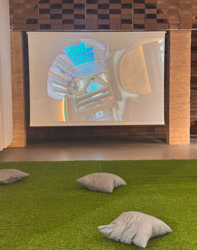
Clara Mas i Casals and Albert Martínez López-Amor. (2026). Sitting at a festival. Specific installation.
Without leaving the same space, we should mention the installation Ciutat, en blanc (2026), by Oriol Armengol (Toormix). It is a set of three anesthetized facades in which white surfaces are deployed, as if they were fragments of skins empty of content that need to communicate their permanence and architectural essence or resignify themselves, in a more demanding way, in the face of the progressive commercialization and depersonalization of cities.
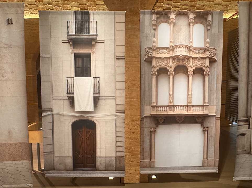
Oriol Armengol. (2026). City, in white. Installation produced by the Toormix studio.
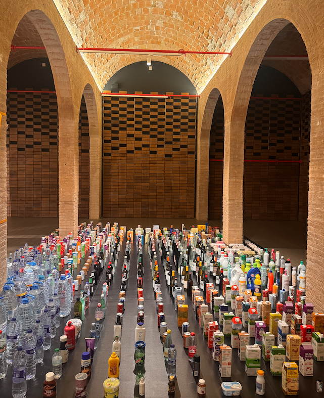
In relation to the section dedicated to For Sale , the transformation of urban space into a commercially lucrative scenario for consumption is critically diagnosed. Along the same lines, the anthropologist Mikel Aramburu analyses, in the article Intercultural coexistence in urban public space ( Barcelona society magazine, no. 16, 2009), the alarming mutation of the public road as a place of passage rather than a space to be in. Buildings function as a great graphic commodity. Everything is for sale and human lives are not contemplated if they do not invoice, as the lyrics of a famous song by the Colombian singer Shakira would say. The notoriety of these commercial transactions is evident in the installation of a kind of city model, designed by the Bas Capo studio. A work that, recalling the pure style of art povera, has been built from elements of the packaging of well-known products that we find in the shopping basket. In short, a scathing critique of the objectification of urban spaces, buildings and infrastructures into a sort of mere merchandise that, among other issues, I suppose will be prioritized in the debates generated around this Barcelona capital.
And beautiful, beautiful, beautiful! Taking up one sixth of the space, Beautiful is the title of a space of memory and nostalgia for a marketing policy by the Barcelona City Council that, between the late eighties and the nineties, promoted the slogan "Barcelona posa't guapa" as a cosmetic operation to empower and reposition monuments, squares and unpublished corners of the city. From a design perspective, it resulted in a great revival of the profession and its international projection through memorable posters, such as, for example, Bar Cel Ona (1979), by Javier Mariscal; Vassily, Kasimir, Lazar strolling along Diagonal (1986), by Pere Torrent; and Barcelona (Patronat de Turisme de l'Ajuntament de Barcelona, 1988), by Pilar Villuendas and JR Gómez. Also included is a series of postcards by Enric Jardí, exhibited in a display case under the title of Barcelona guapes (2026). A multitude of iconic images of architecture, monuments or urban emblems, from the sixties to the present day. Each postcard constitutes a diversity of ways of showing and projecting the city to the outside world, from commercial, political and touristic perspectives.
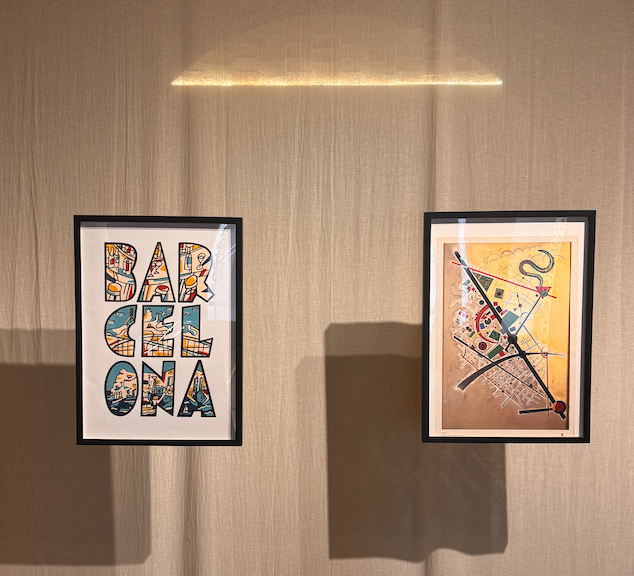
Javier Mariscal. (1979). Bar Cel Ona (left and Pere Torrent. (1986). Vassily, Kasimir, Lazar walking along Diagonal (right). Posters.
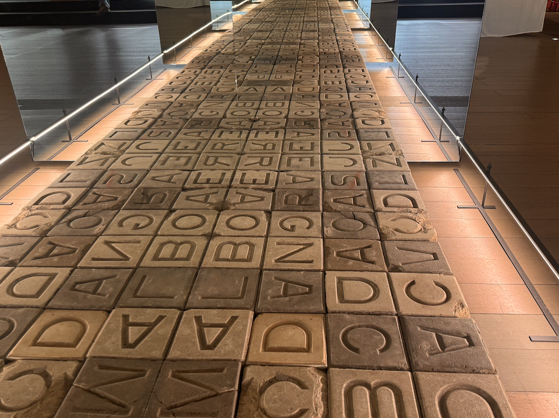
Social commitment. Regarding the most contextual and social chapter, called Overcoming the Sidewalk , it is necessary to emphasize the installation Sidewalks (2007-2026), by Frederic Perers. It is a sidewalk with letters, made up of forty-eight pieces of letters recovered from various streets in the Poblenou neighborhood. Likewise, from a more inclusive and committed perspective, the community, commercial and social projects of #Ravalkm0 (2016_01), with designs by Maria Güell and Curro Claret, and #Ravalkm0 (2018_57), with designs by Maria Güell, stand out. Specifically, I will highlight the first project, in which, thanks to the impetus of the Tot Raval Foundation and the neighborhood's associative network, local commerce was boosted and employment was generated for vulnerable and unemployed people, through the production and design of Christmas lights for the neighborhood, inspired by photographs of neighbors.
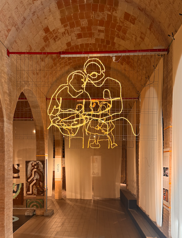
Maria Güell and Curro Claret. (2016). #Ravalkm0 (2016_01). Espai Desbordar les voreres. Espai Guapa. Installation of Christmas lights.
Soundscape. The last part, Voices , is an audio piece created for the exhibition in collaboration with the Istituto Europeo di Design in Barcelona. This sound document selects fragments of interviews with around twenty design professionals —some of whom are present at the exhibition— to trace a plural landscape of opinions. This sound transfer helps to understand conflicts, difficulties, paradigms, theories or findings that emerged around the different graphic projects.
After touring the eight spaces, I have the impression that this exhibition highlights the communicative (visual and typographic language), creative, aesthetic and functional revaluation of design in its relationship with the architectural bodies of the city. A discipline that, however, cannot always provide answers or assume firm commitments in the midst of a dialectical tension between the planned city and the inhabited city. In a context marked by the systemic violence of gentrification and the spectacularization of spaces, the task of design and architecture must be claimed from a discursive and propositional autonomy, capable of overcoming the traditional dependence on corporate marketing.
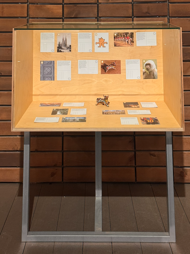
Beautiful Barcelona (2026). Beautiful Barcelonas. Postcards in a display case.
You may be
interested
...